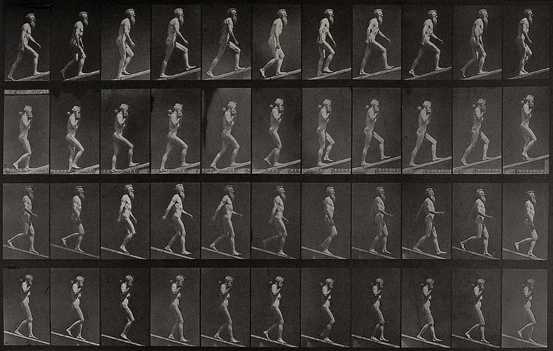
Ascending an incline and descending an incline. Photogravure after Eadweard Muybridge, 1887
In this month’s series of blog posts on Photobooks, we look at some examples of how grids have been used in the design of photobooks, including two superb new photobooks that use grids to add narrative depth to images.
Catch up on last month's addition exploring how Russet Ledermann and Olga Yatskevich stepped in to share the previously unwritten history of women in photobooks:

Open a photobook and more often than not you will find image laid out uniformly on a page. Sometimes they will be on the right side of the spread, with a blank page on the left, sometimes they will be paired, sometimes there will be multiple images on the page.
Almost every time you see this, you are seeing a designer who has used some kind of grid to place images, to keep a uniformity of form across the book that makes it easier to engage with visually.
The grid can do many things. Historically it links in to ideas of science and measurement. Eadweard Muybridge presented his images of human and animal movement in grids. Anthropologists used backgrounds of measuring grids to compare and contrast different ethonographic groups (often for racist ends).
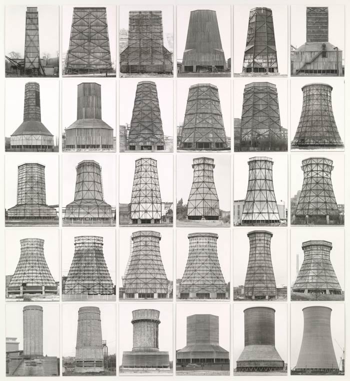
Berndt and Hilla Becher: Anonymous Sculpture, 1970
That idea of contrasting and comparing images in grids was also used by Berndt and Hilla Becher’s in their brilliant typological series on water towers, blast furnaces, and gas tanks. With every image photographed large format in fairly uniform diffused light (the sun wasn’t shining) from a ladder for even composition, they produced pictures where the unity of background information made it easier to compare the differences between a pair of, for example, water towers presented on facing pages.
In other books and installations, the grids got larger, but the principle of a new ‘New Objectivity’ remained the same. The grid served to highlight both difference and the Becher’s idea of industrial beauty; their first and best-known photobook Anonymous Sculptures references Marcel Duchamp’s ready-mades and the idea that the industrial buildings they photographed were some kind of art object in themselves.
Want to take your photography career to the next level?
The MA in Photography from Falmouth Flexible will give you valuable insights which you can immediately apply to your work:

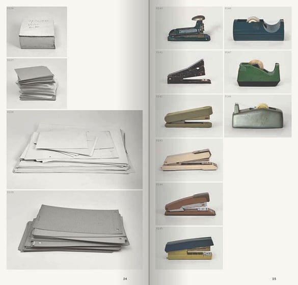
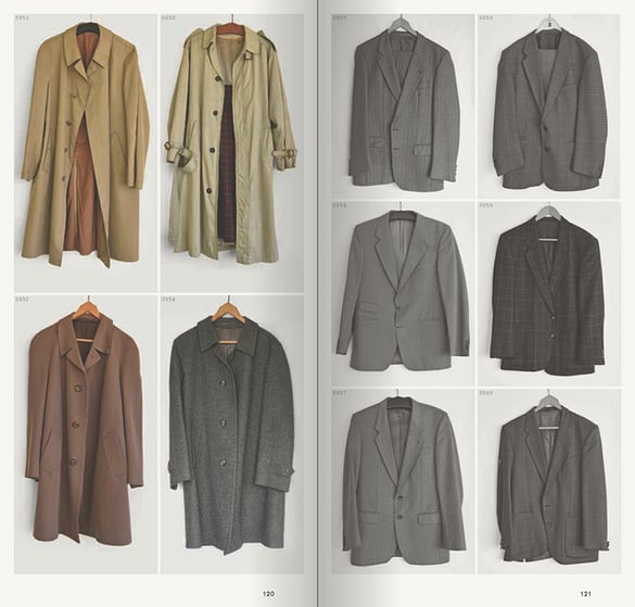
The grid in photobooks continues to fascinate and two recent photobooks use it to beautiful and devastating effect. In Eindhovenseweg 56 Ton Grote photographed all the objects his father owned as they cleared up the old family home. Presented in a modestly sized book, the objects are laid out in sequence on a page. The book starts with clocks (so bringing the idea of time into the design) and goes on to document the toys the children owned, the suits his father owned, the radios, the kitchen ware, the frying pans, everything.
1078 Blue Skies/4432 Days, Anton Kusters
Design is everything and the grids that the photographs are laid into are slightly disrupted by the designer, Jeremy Jansen. There are multiple grids. This lets a softness into the book which is accentuated by the warmth of the uncoated paper. Rather than being the intriguing, but rather cold comparisons that is invited by the Bechers, it feels like you are exploring through the family history of Ton Grote and his family.
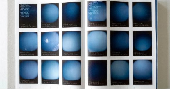
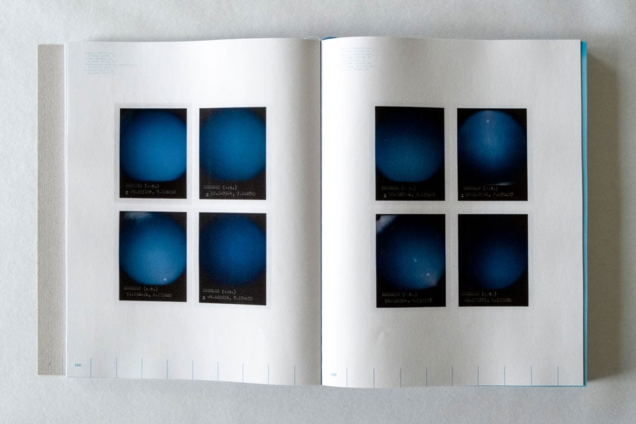
Anton Kusters’ 1078 Blue Skies/4432 Days uses the outstanding design of renowned Dutch (the Dutch are renowned for book design) designer Teun van der Heijden to transform something that was quite abstract into a quite concrete visual rendition of the Nazi Concentration Camp system.
The book started with the 1,078 polaroid images of blue skies over the 1,078 official concentration camps built by the Nazis. In exhibitions, Kusters used location, sculpture and sound to add narrative to his images.
1078 Blue Skies/4432 Days, Anton Kusters
For the book, van der Heijden created a grid system on which images were laid out. He also created a chronology throughout the book, with lines marking each day of Nazi rule, starting in 1932. There are 10 lines a page, and on the days when a concentration camp is built, the image of the sky over that concentration camp appears, complete with text featuring the GPS location of the site, as well as the number of deaths at the camp. The images start in 1933 (a camp in Berlin) and continue over the 4,432 days of Nazi rule. The numbers of deaths range from a handful at some of the minor camps to the 1,471,595 (est) murdered at Auschwitz-Birkenau.
With the grid containing up to 18 images on a two page spread (the chronology determined the design), the grid tells the story of the scale of the Germany’s Concentration Camp System, and the way it extended beyond the war years. Kusters’ quite abstract images of blue skies are grounded in the very harsh reality of a killing and torture machine.
The MA in Photography is designed to enhance the creative, critical, and professional skills of practitioners regardless of where they are in their careers. Find out more about the programme:
 Colin Pantall is a photographer, writer and lecturer and teaches on the MA Photography programme at Falmouth University.