Creating an effective company logo requires skills that go beyond simply being able to design well. A good logo has a unique but simple design that is distinctive, memorable, versatile, and appropriate for the brand it represents.
We see numerous company logos every day – on the clothes we wear, the shops we pass, the food we buy – without thinking twice about them. But did you know that many of the world’s most recognisable logos have a hidden additional meaning? Take a second look at these famous brand symbols:
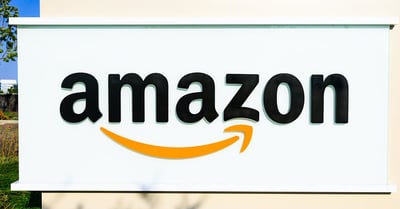
Amazon
If you can’t find it on the world’s biggest online retail site, it probably doesn’t exist – a philosophy that is reflected in the company’s logo. Look carefully at the yellow arrow and you’ll notice that it starts at the letter ‘a’ and ends at the letter ‘z’, implying that Amazon sells everything from a to z. Shaped like a smile, the arrow also represents the satisfaction customers feel when they shop with Amazon (possibly less so when they check their monthly bank statement).
.jpg?width=400&height=261&name=_ugc-1_1_4_0_bigstock-CHICAGO-ILLINOIS--AUGUST---%20(1).jpg)
NBC
The National Broadcasting Company’s famous peacock logo dates back to 1956, when the network ‘proudly’ began to show an increasing number of programmes in colour. NBC’s parent company, RCA, manufactured colour television sets, so the colourful peacock logo was also a subtle marketing tool to encourage people to purchase colour television sets. The six different colours of the peacock’s feathers represent the six divisions of NBC. The icon has undergone several transformations over the past five decades but remains one of the most recognisable logos in the communications industry.
.jpg?width=400&height=267&name=_ugc-1_1_4_0_bigstock--186580795%20(1).jpg)
Baskin Robbins
Look closely at the Baskin Robbins logo and you’ll see that the ice cream chain has hidden the number of original flavours it offers (31) between the letters ‘B’ and ‘R’. "The 31 stands for our belief that our guests should have the opportunity to explore a fun, new ice cream flavour every day of the month," VP of marketing Carol Austin told CNBC. The pink and blue logo, which was introduced as a brand refresh in 2005, is intended to represent fun and energy.
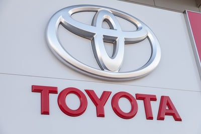
Toyota
Introduced in 1990, the car manufacturer’s distinctive logo is instantly recognisable. According to the company’s website, the three overlapping rings symbolise ‘the unification of the hearts of our customers and the heart of Toyota products.’ The background space represents Toyota’s technological advancement and the boundless opportunities ahead. In addition, the logo manages to show a ‘T’ for Toyota and the shape of a steering wheel. Designed to look the same when viewed normally and through a rear-view mirror, the logo is one of the most complex and effective in the automotive industry.
%20(2).jpg?width=400&height=267&name=_ugc-1_1_4_0_bigstock-Lafayette--Circa-February--%20(1)%20(2).jpg)
FedEx
Can you spot the arrow in the negative space of the FedEx logo? The shipping company’s design won over 40 awards worldwide and was ranked one of the 8 best logos of the past 35 years by Rolling Stone magazine. Designer Lindon Leader said, “The arrow could connote forward direction, speed and precision, and if it remained hidden, there might be an element of surprise, that aha moment.”
Interested in pursuing a career in graphic design? Earning an MA in Graphic Design from Falmouth University’s Flexible Learning programme can help you stay on top of current design trends and kick start your career. For more information, visit our course page.
Discover more:
5 surprising career opportunities for graphic designers


